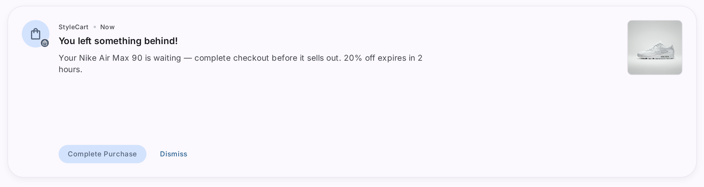
Bottom sheets are UI surfaces anchored to the bottom of a mobile screen that display supplementary content or prompt users to complete critical actions.
According to mobile UX research, bottom sheets achieve 25-30% higher engagement rates than traditional modals because they’re less intrusive and easier to dismiss, making them ideal for feature announcements, product launches, offers, and action prompts without disrupting the user experience.
TL;DR:
- Bottom sheets in mobile apps are screen-anchored surfaces that present supplementary content without navigating users away from their current context
- They achieve higher engagement than full-screen modals while maintaining user flow continuity
- Best uses: product launches, announcements, limited-time offers, critical action prompts, feature discovery, and cross-selling
- Real examples: Niyo uses them for credit card launches, MakeMyTrip for offer showcases, Dunzo for cart upsells, Slack for UI updates
- No-code platforms like Plotline enable teams to create, test, and deploy bottom sheets in days without developer dependency
What Are Bottom Sheets in Mobile Apps and How Do They Work?
A mobile app bottom sheet is a supplementary UI surface that slides up from the bottom of the screen to display content while keeping the current screen context visible in the background. Unlike full-screen modals that take over the entire interface, bottom sheets preserve spatial awareness and feel less disruptive to users.
Key characteristics of bottom sheets:
- Anchored positioning: Always originate from the bottom edge of the screen
- Contextual overlay: Display supplementary information without full navigation
- Easy dismissal: Users can swipe down or tap outside to close
- Action-oriented: Typically contain CTAs that drive specific user behaviors
- Context preservation: Background remains partially visible, maintaining spatial awareness
Bottom sheets come in two main variants:
- Modalbottom sheets: Block interaction with the underlying screen until dismissed
- Persistent bottom sheets: Allow simultaneous interaction with background content
How to Use Bottom Sheets for Announcements in Mobile Apps: Examples
Bottom sheets excel at delivering announcements because they balance visibility with user control. Here’s when to deploy them:
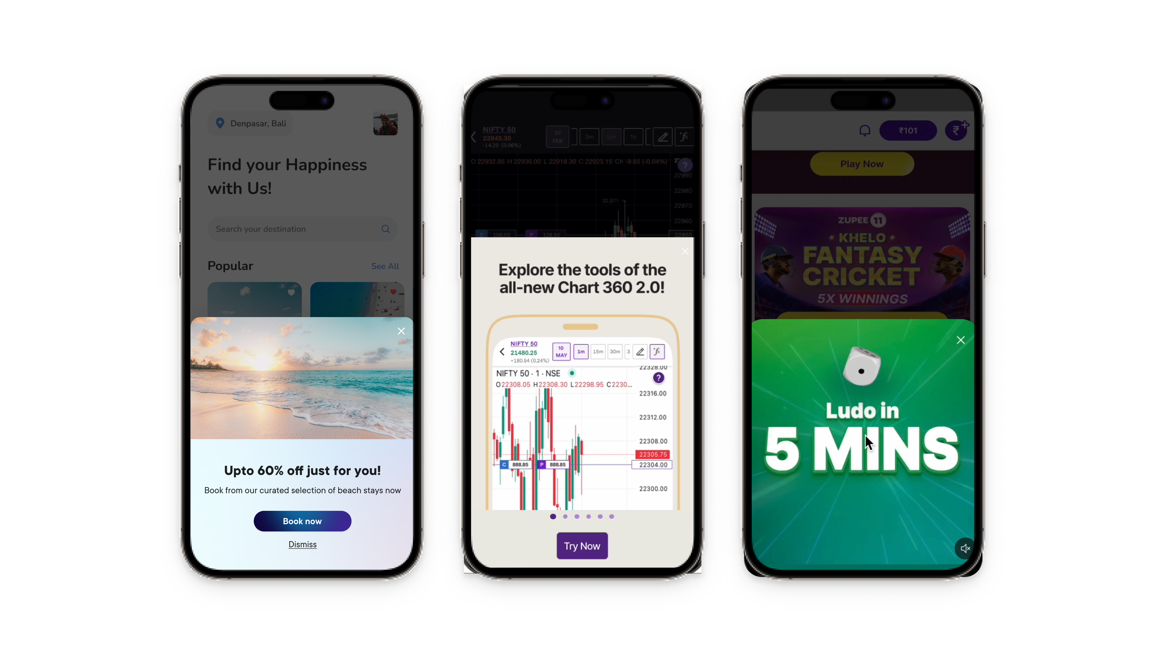
Product Launches and New Offerings
Introduce new products or services to existing users without disrupting their primary task. Bottom sheets let you showcase value propositions while keeping core functionality accessible.
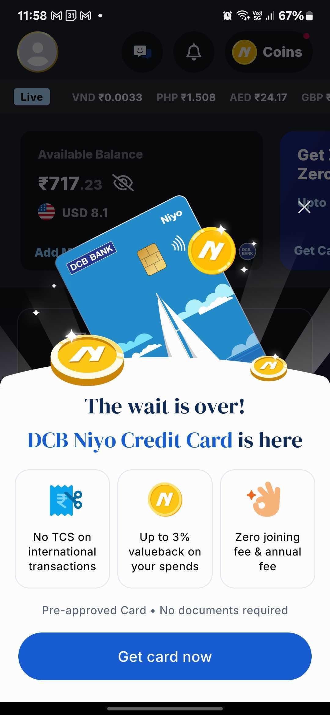
Example: Niyo uses a bottom sheet, created through Plotline on their home screen to announce the launch of their DCB Niyo Credit Card. The announcement maintains context by keeping the user’s balance and forex rates visible in the background while presenting the new offering.
App Updates and Feature Releases
Show users what’s new without forcing them through a full onboarding flow. Users can quickly scan updates and dismiss when ready.
Example: Slack uses a bottom sheet to announce their redesigned UI when users launch the app after an upgrade. The announcement provides context without blocking access to core functionality.
.gif)
Time-Sensitive Notifications
Limited-time offers, flash sales, and urgent updates work perfectly in bottom sheets because they demand immediate attention without completely disrupting the user’s current task.
Example: MakeMyTrip displays a bottom sheet showcasing discounts and offers, nudging users to make bookings before deals expire.

System Changes or Policy Updates
When you need users to acknowledge important changes - privacy policy updates, terms of service modifications, or operational announcements, bottom sheets provide the right level of prominence.
How to Improve Feature Adoption Using Bottom Sheets
Bottom sheets drive feature adoption by introducing capabilities at contextually relevant moments. The key is timing and targeting.
Progressive Feature Discovery
Instead of overwhelming new users with all features at once, use bottom sheets to introduce functionality as users progress through their journey.
Example: Headway triggers a bottom sheet when users have an unfinished daily goal, encouraging them to maintain their commitment to personal growth. This contextual prompt increases goal completion rates.

Incentivized First Action
Reduce friction for first-time feature usage by offering value upfront through bottom sheet promotions.
Example: Khatabook uses a bottom sheet when users click the “coins” button, offering free coins as a reward for completing their first coin recharge. This incentivized prompt dramatically increases feature trial rates.

2025 Best Practices: When and How to Use Bottom Sheets
1. Use Bottom Sheets For:
- Product launches: Introduce new offerings to existing users (like Niyo’s credit card)
- Announcements: Feature launches, updates, policy changes
- Cross-sell opportunities: Leverage existing trust to introduce complementary products
- Offers and promotions: Time-sensitive deals, discounts, rewards
- Critical actions: Confirmations, permissions, account updates
- Featurediscovery: Introducing hidden or underused functionality
- Cart optimization: Upsells, cross-sells, abandoned cart recovery
2. Avoid Bottom Sheets For:
- Complex forms: Multiple input fields feel cramped in bottom sheets
- Long-form content: Extensive text is better suited for dedicated pages
- Frequent interruptions: Overuse creates notification fatigue
- Initial onboarding: Full-screen flows work better for first-time users
3. Design Principles That Drive Results
Keep CTAs singular and specific “Get card now” (Niyo) and “Claim 20% Off” beat vague “Learn More.” Users should know exactly what happens when they tap.
Lead with value, not features Niyo’s “The wait is over!” creates excitement, while benefit tiles quickly communicate what users gain. Emotion first, features second.
Eliminate friction proactively Address objections before users think them. “Pre-approved • No documents required” removes conversion blockers instantly.
Match your app’s design system Generic bottom sheets feel disconnected. Maintain brand consistency with colors, fonts, corner radius, and animations (like Niyo’s floating coins).
Make dismissal obvious Include visual cues (drag handle, X button) so users feel in control. Never trap users in bottom sheets.
Optimize for one-handed use CTAs should be thumb-reachable on larger phones. Test on multiple screen sizes.
Use progressive disclosure Start with the key message. Reveal details only if users want more information. Niyo’s three benefit tiles provide quick scans without overwhelming.
Maintain spatial context Keep background content partially visible so users know where they are. This reduces the disorienting effect of sudden overlays.
4. Targeting Strategies That Maximize Impact
Event-based triggers are more effective than time-based ones:
- Show cart upsell bottom sheets when cart value crosses a threshold
- Trigger product launch announcements on home screen visits (high engagement context)
- Display feature announcements when users visit related sections
- Show offers when users browse but don’t convert
User segmentationprevents annoyance:
- New users: Onboarding tips and feature discovery
- Existing users: Cross-sell opportunities and new product launches (like Niyo)
- Power users: Advanced features and loyalty rewards
- Inactive users: Re-engagement offers and what’s new
Frequency capping maintains respect:
- Limit promotional bottom sheets to once per session
- Never show the same announcement twice
- Implement cooldown periods between different bottom sheets
- Use one-time triggers for product launches to avoid repeated interruptions
The Challenge: Why Creating Bottom Sheets Takes Too Long
Your developers are shipping features, not notifications. Building the core app functionality takes priority. Creating, updating, and A/B testing bottom sheets falls to the backlog, permanently.
Traditional implementation is slow:
- Design and development: 2 weeks
- App store submission and review: 1-2 weeks
- Data collection and analysis: 3-4 weeks
That’s 6-8 weeks per iteration. Want to test three variations of a product launch announcement? You’re looking at 4-5 months.
Market opportunities don’t wait. Product launches, competitive moves, festive sales, feature releases - all require rapid response. Waiting for release cycles means missed revenue and momentum.
How to Choose a Bottom Sheet Solution: The No-Code Advantage
Plotline empowers product and marketing teams to create, deploy, and optimize bottom sheets without engineering dependency or app releases.
Beyond Bottom Sheets
Plotline offers a complete in-app engagement suite:
- Coachmarks and spotlights: Feature discovery and guidance
- Tooltips: Contextual help and tips
- Stories: Content discovery in familiar formats
- PiP videos: Tutorial delivery without navigation
- In-line widgets: Promotions within existing screens
All fully customizable. All fully no-code. All deployed instantly.
Ready to deploy bottom sheets in your mobile app? Book a demo and create your first bottom sheet in minutes—no developers required, no app release needed.