.png)
.png)
Mobile app modals are overlay windows that appear on top of your app’s main interface to deliver targeted messages, drive specific actions, or capture user attention at critical moments.
When designed correctly, they can boost conversion rates and become one of your most powerful tools for user engagement - but poor implementation can frustrate users and hurt retention.
TL;DR:
- Mobile modals are pop-up overlays that appear on app screens to grab attention and prompt specific user actions
- There are three main types: full-screen modals, partial overlays, and pop-ups—each serving different use cases
- According to recent data, mobile popups convert at 5.60%, outperforming desktop by 97% when designed correctly
- Best practices include: timing (show after 6 seconds), clear close buttons, mobile-optimized sizing, and limiting frequency
- Use modals sparingly for high-impact moments; choose tooltips or slideouts for routine announcements
- Poorly designed mobile modals can lead to 85.65% cart abandonment and significant user churn
What Is a Mobile App Modal and When Should You Use It?
A mobile modal is an overlay interface element that temporarily interrupts the user’s current workflow to display important content, request decisions, or guide users toward specific actions. Unlike desktop modals, mobile modals must work within severe space constraints- which makes their design and timing absolutely critical.
The Three Main Types of Mobile Modals
Understanding which modal type to use can make the difference between engagement and abandonment:
1. Full-Screen Modals
Full-screen modals take over the entire mobile interface, creating a dedicated focus environment. They’re ideal for onboarding flows, critical confirmations, or showcasing detailed information that requires undivided attention.

Pros:
- Maximum screen real estate for complex content
- Eliminates distractions completely
- Perfect for multi-step processes
Cons:
- Most disruptive option—can feel jarring if mistimed
- Users may confuse them with new screens, losing context
- Risk of abandonment if content doesn’t immediately provide value
2. Partial Overlays (Half-Screen or Cover Sheet)
These modals cover only a portion of the screen, keeping the underlying content partially visible. They strike a balance between grabbing attention and maintaining context.
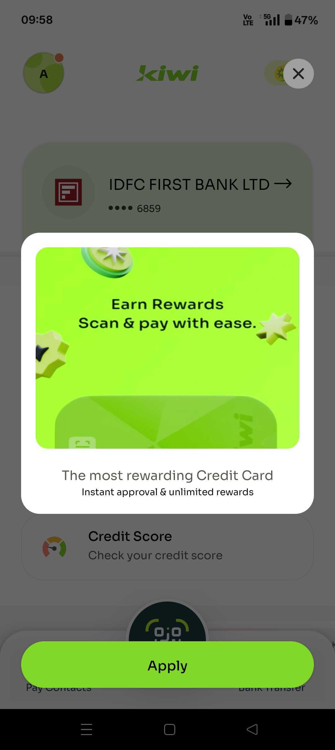
Pros:
- Less disruptive than full-screen options
- Maintains visual context of the parent screen
- Ideal for iOS-style bottom sheets that feel native
Cons:
- Limited space for content
- Can still interrupt workflow if overused
- May not command enough attention for critical messages
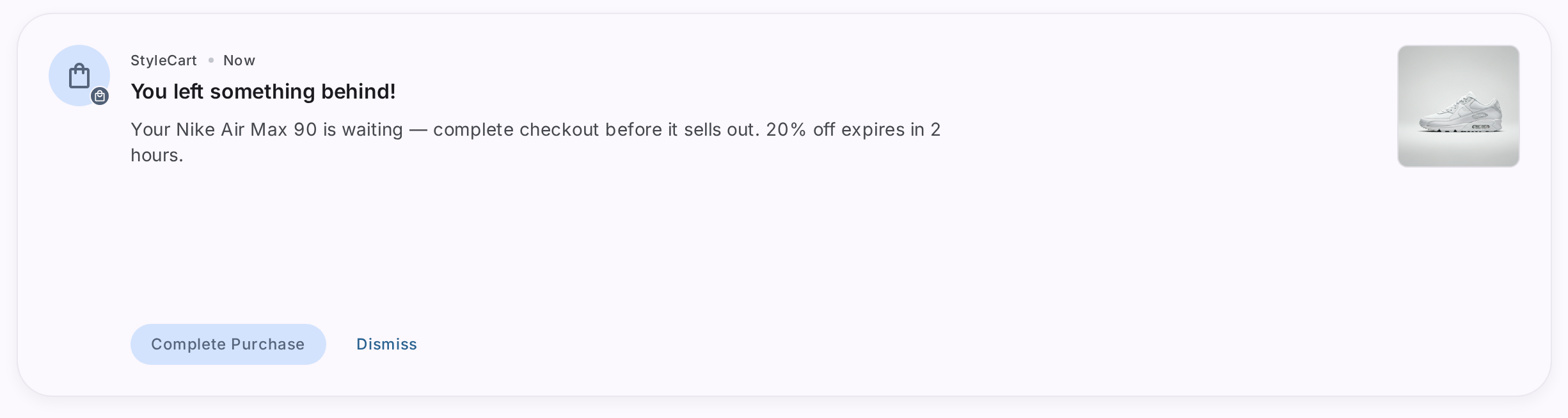
3. Pop-Ups
Traditional pop-up modals appear as smaller windows centered on the screen, typically with a semi-transparent backdrop. They’re commonly used for permission requests, quick confirmations, or brief announcements.
.png)
Pros:
- Quick to implement and familiar to users
- Effective for simple yes/no decisions
- Can be dismissed easily
Cons:
- Often associated with spam and aggressive marketing
- Limited space on mobile screens
- Risk of close button being too small or hard to reach
How to Choose Between Modals, Tooltips, and slideouts
Not every message deserves a modal. Here’s when to use each pattern:
Use Modals When:
- You need to confirm destructive actions (like account deletion)
- Users must make a decision before proceeding
- Announcing major product updates or features
- Capturing email signups or permissions at high-value moments
- Onboarding new users through multi-step flows
UseTooltipsWhen:
- Providing contextual help for specific UI elements
- Introducing minor feature updates
- Guiding users through feature discovery
- Explaining unfamiliar icons or terminology
Use slideouts sheets When:
- Displaying secondary information that complements the main experience
- Showing settings or preferences panels
- Presenting filter options or search refinements
- Delivering non-critical announcements
According to UX research, modals are the most intrusive pattern—but that’s precisely why they work for high-stakes moments. Tooltips are 75% less disruptive and should be your default for routine guidance.
Best Practices for Mobile Modal Design in 2026
1. Timing Is Everything
Timer-based modals set to appear after 3-6 seconds convert better than those triggered by scroll depth. Give users time to land on your screen and orient themselves before interrupting their experience.
Never show modals:
- Immediately upon app launch (unless it’s a critical system message)
- During active form completion
- When users are mid-purchase or checkout
- In rapid succession—limit to one modal per session for non-critical messages
2. Mobile-Optimize Your Modal Size and Layout
Here’s where many teams fail: desktop modals don’t translate to mobile. According to anUserpilot research, poorly sized modals on mobile cause the close button and CTA to get lost, leading users to abandon the app entirely rather than struggle with the interface.
Mobile-specific requirements:
- Full-screen modals should use 100% width and height
- Partial modals should cover 60-80% of screen height
- Tap targets must be minimum 44x44 pixels (Apple’s guideline)
- Close buttons should be positioned for one-handed use (bottom right or bottom left)
- Font sizes should be at least 16px to avoid forced zoom
The traditional upper-right close button defies mobile ergonomics. Research by Luke Wroblewski shows that most users hold phones one-handed with their thumb as the primary navigation tool - making upper-right placement the hardest spot to reach.
3. Keep Content Scannable and Action-Oriented
You’re interrupting someone’s workflow. Make it worth their time.
Content guidelines:
- Headlines should be under 50 characters
- Body copy should be under 150 characters
- Use one clear CTA per modal
- Include visuals to convey messages faster (images process 60,000x faster than text)
- Avoid jargon - your modal should be understandable in 3 seconds or less
4. Always Provide a Clear Exit
Never trap users in a modal. According to conversion optimization data, 43% of users abandon apps when they can’t easily dismiss unwanted overlays.
Exit options:
- Visible X button or “Close” text
- “Cancel” or “No thanks” button for decision modals
- Swipe-to-dismiss for low-friction modals (iOS standard)
- Outside-tap to close for non-critical overlays
High-friction modals (like confirmation dialogs) should require explicit dismissal through a button, not swipe or tap-outside.
5. Respect Accessibility Standards
Modal accessibility isn’t optional - it’s essential for reaching all users and avoiding legal issues.
Accessibility checklist:
- Set focus to the modal when it opens
- Support keyboard navigation (Tab, Enter, Escape keys)
- Include ARIA labels for screen readers
- Ensure sufficient color contrast (WCAG AA minimum: 4.5:1)
- Test with screen readers (VoiceOver for iOS, TalkBack for Android)
- Trap focus within the modal until dismissed
Common Mobile Modal Mistakes to Avoid
Mistake #1: Using Too Many Modals
Modal fatigue is real. Users habituate to repeated interruptions and start dismissing them automatically. Research shows that using more than one modal consecutively annoys users and decreases overall engagement.
The fix: Limit modals to truly important moments. For product tours or multi-step onboarding, use a carousel-style modal that allows users to click through multiple screens within one modal, rather than stacking separate modals.
Mistake #2: Ignoring Mobile Context
What works beautifully on desktop often fails miserably on mobile. Modal windows that are perfectly readable on a 27-inch monitor become illegible and frustrating on a 5-inch phone screen.
The fix: Design mobile-first, then adapt for desktop—never the reverse. Test on actual devices, not just emulators. According to UX research, mobile modals should use fullscreen or bottom-sheet patterns rather than attempting to replicate desktop centered-box layouts.
Mistake #3: Poor Close Button Placement
The standard upper-right X button placement forces users to stretch their thumb across the entire screen—a movement that’s neither intuitive nor comfortable.
The fix: Place close buttons in the lower right or lower left corner where thumbs naturally rest. For confirmation modals, provide both a primary action button and a clear “Cancel” option at thumb-friendly positions.
Mistake #4: Showing Modals at the Wrong Time
Interrupting users mid-task destroys conversion potential. A modal asking for a rating while someone is trying to complete checkout is the fastest way to lose a sale.
The fix: Use behavior-based triggers:
- Show permission request modals after users experience the value that requires the permission
- Display feedback requests after successful task completion
- Time promotional modals to low-engagement moments, not active workflows
- Test different timing triggers and measure abandonment rates
Mistake #5: Overloading Modals with Content
Cramming too much information into a mobile modal overwhelms users and defeats the purpose of focused attention.
The fix: If you need to convey complex information, either break it into multiple steps within a single modal carousel, or reconsider whether a modal is the right pattern. Some content is better suited for dedicated screens or inline expansion.
Real-World Mobile Modal Examples That Work
Spotify: Feature Discovery Done Right
Spotify uses a partial overlay modal to introduce users to their smart home integration. The modal appears after users have established regular listening habits—not immediately upon first launch. It includes a clear visual showing the connected devices, concise copy explaining the benefit, with an easy dismiss option.
Why it works: The timing respects user context, the visual immediately communicates value, and the modal doesn’t block critical functionality.

Sephora: Change Management Communication
When Sephora redesigned their app interface, they used a full-screen modal to inform users about the changes. Rather than just announcing “We’ve updated our design,” they highlighted specific improvements and reassured users that their experience would remain seamless.
Why it works: Proactive communication about UI changes prevents confusion and reduces support tickets. The full-screen treatment ensures the message isn’t missed

Deliveroo: Activation Through Incentives
Deliveroo’s conversion modal nudges new users to place their first order by offering free delivery for a limited time when they order above a certain value. The modal appears after users have browsed menus—showing intent—but before they’ve made a purchase decision.
Why it works: It addresses the common first-time buyer hesitation (delivery costs) at exactly the moment when the incentive can influence behavior.

Dunzo’s discount display
Dunzo’s modal introduces different variety of apples given for a 5% discount during the season. This is targeted to users who are an active user purchasing fruits on a regular basis.

How Plotline Helps You Create High-Converting Mobile Modals Without Code
Building effective mobile modals traditionally requires developer resources and multiple iteration cycles. We know that shipping fast matters - and waiting weeks for dev resources to implement a simple modal doesn’t make sense.
Plotline empowers product and marketing teams to create and deploy mobile modals (plus tooltips, spotlights, videos, streaks and more) without writing a single line of code. Design modals that match your app’s theme perfectly, target them to specific user segments, and launch them in minutes instead of weeks.
From onboarding new users and driving conversions to announcing feature updates and collecting feedback, Plotline helps you engage users at exactly the right moment, without the dev bottleneck.
Ready to create modals that convert? Book a demo today.
Summary
Mobile app modals remain one of the most powerful and most misused engagement tools in product design. When implemented correctly with proper timing, mobile-optimized sizing, and clear value propositions, modals can achieve conversion rates exceeding 5%, significantly outperforming desktop alternatives.
The key is understanding that mobile modals operate under different constraints than their desktop counterparts. Small screens, one-handed navigation patterns, and higher user expectations for seamless experiences mean that mobile modals must be more strategically deployed and carefully designed. Use full-screen modals for high-stakes moments like onboarding and critical confirmations, partial overlays for contextual messages that maintain screen context, and traditional pop-ups sparingly for simple decisions.
Remember the core principles: show modals after 3-6 seconds for optimal conversion, always provide clear exit options, optimize for thumb-friendly interactions, and respect the 85.65% mobile cart abandonment rate by avoiding disruptive modals during checkout flows. Most importantly, treat modals as the high-impact tool they are - reserve them for moments that genuinely deserve to interrupt your user’s experience. For routine guidance, announcements, and contextual help, reach for less intrusive patterns like tooltips and slideouts instead. The future of mobile engagement isn’t about using more modals - it’s about using the right modal, in the right place, at exactly the right time.