Context
In ride-hailing apps like Uber, estimating the time it takes for a driver to reach the user is crucial for a smooth user experience.
Knowing the ETA allows users to plan their pick-up location and wait time, reducing anxiety and ensuring a positive experience.
Why this works
A floater, a UI element that remains on top of other app content, is an effective way to display the ETA for several reasons:
- Visibility: Since the floater is always on top, the ETA remains constantly visible to the user, eliminating the need to navigate through different app screens.
- Clarity: The floater can be designed to be clear and concise, displaying only the essential information like the ETA and driver distance.
- Real-time updates: The ETA can be updated dynamically within the floater as traffic conditions or driver location change.
Check out more user experiences from leading apps
 Discovery & AdoptionPowered by Plotline
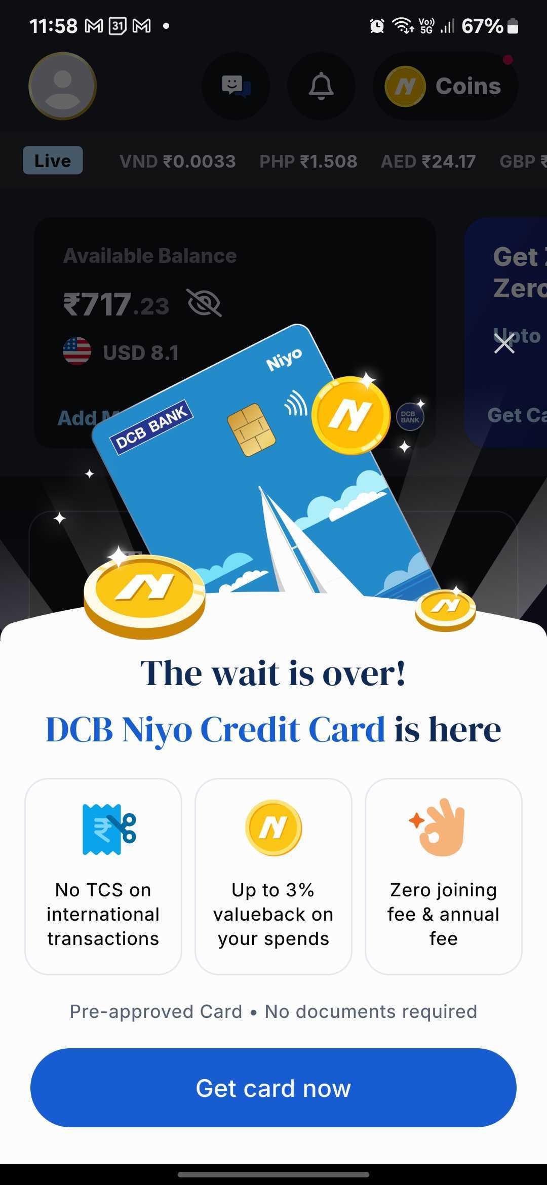
Niyo Uses a Bottom Sheet to Announce New Product Launches Without Disrupting the Core Experience
Read more
 Onboarding & Activation
Stable Money Uses a Step-by-Step Profile Quiz to Personalize the Investment Journey
Read more
 Monetization
Zepto Uses Scrollable Video Widgets to Showcase Sponsored Products in Search
Read more
 Discovery & Adoption
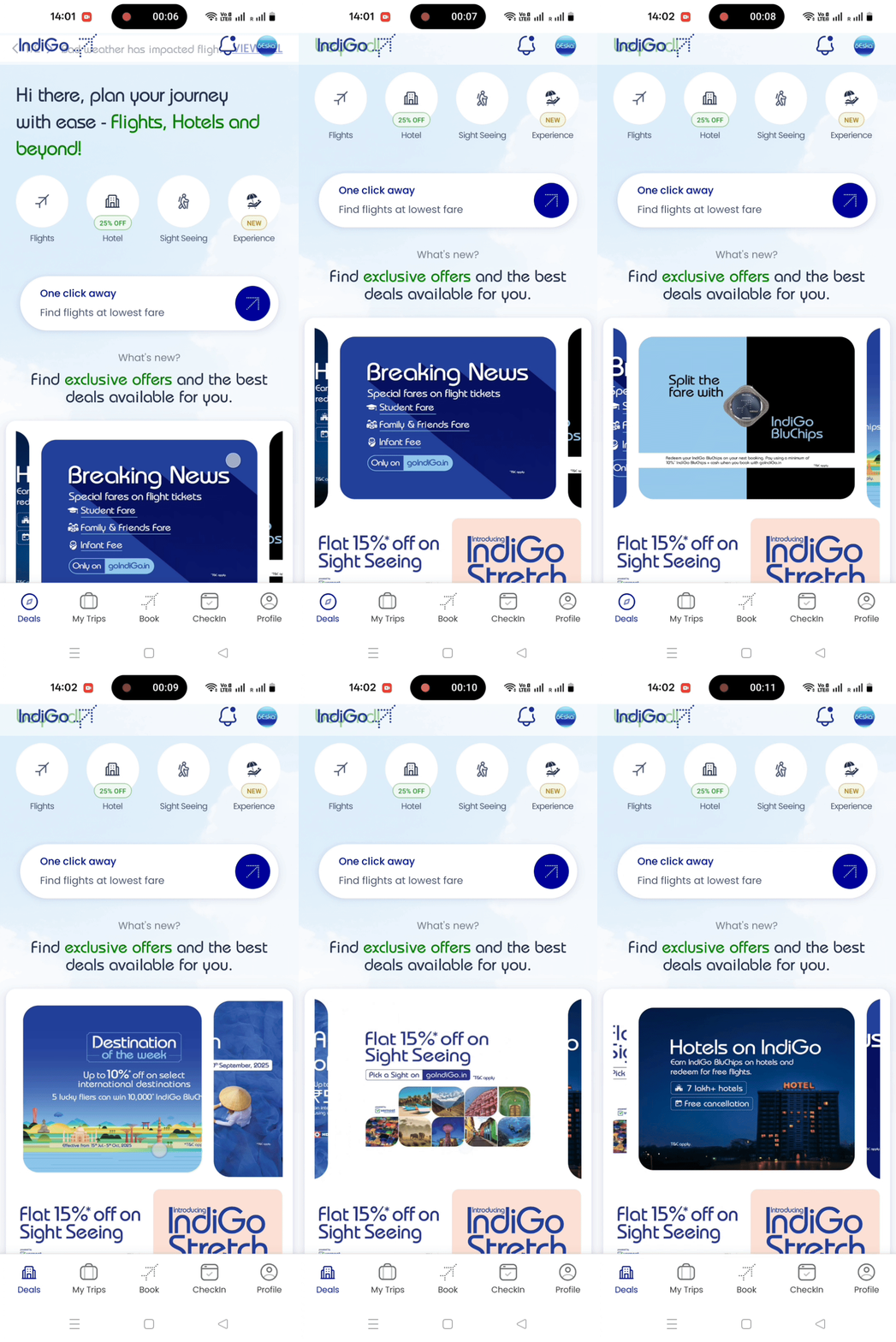
IndiGo Uses Swipeable Deal Strips to Drive Offer Discovery
Read more
 Discovery & Adoption
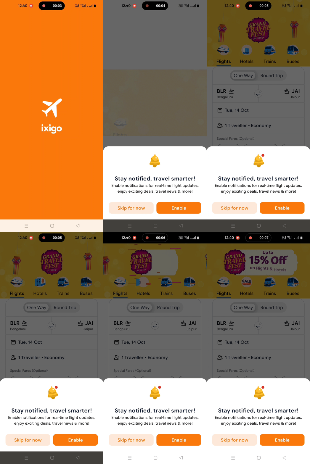
ixigo Maximizes Push Notification Opt-ins with Bottom Sheet
Read more
 Monetization


%20(1).gif)

.gif)