
Context
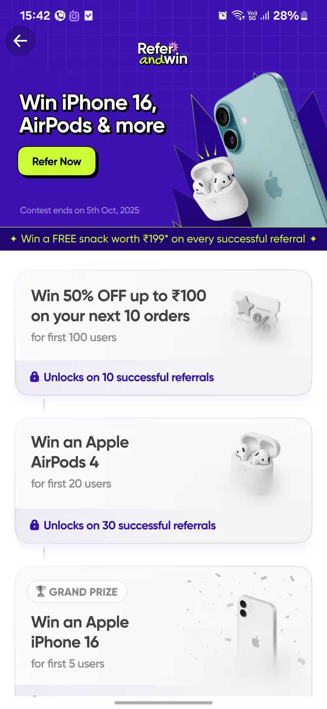
Content apps always try to drive higher watch times 📺 and engagement on their most popular shows.
When SonyLiv launched Rocket Boys Season 2 🚀, they wanted to nudge more users to start watching. In addition to placing it front and centre on the homepage, they also configured a Slider to draw user attention.
Why this works
This campaign was made highly relevant by only targeting users who’ve watched Season 1 in the past, but had still not started watching any episode of Season 2.
By rolling out the Slider to only 50% of the above eligible audience cohort, SonyLive can easily measure 🧐 watch rates for Season 2 between audiences who saw the slider vs those who didn’t, and validate the impact of such an in-app campaign.
A great example of using distinguished UI elements that blend in natively with your app to subtly guide your users to take the right action.
Check out more user experiences from leading apps
 Discovery & AdoptionPowered by Plotline
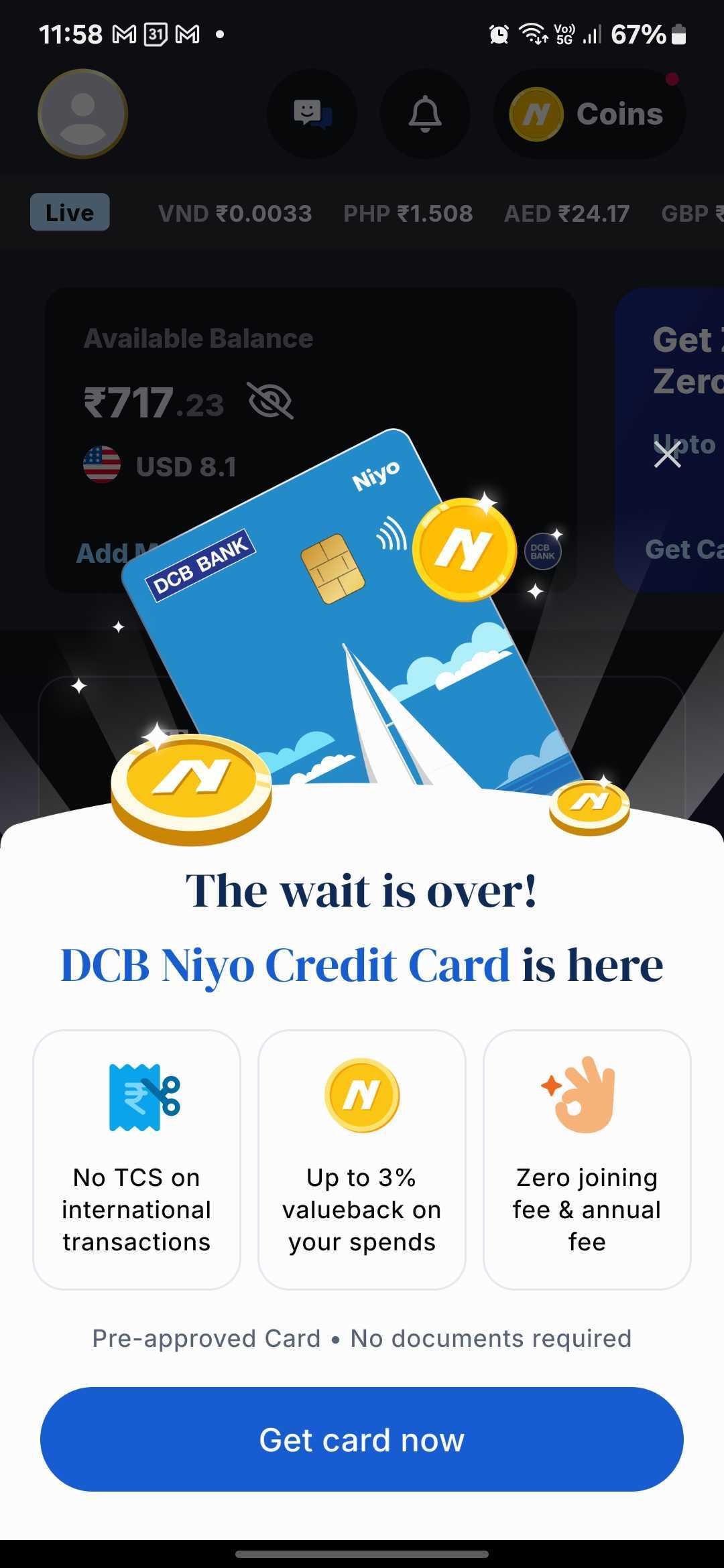
Niyo Uses a Bottom Sheet to Announce New Product Launches Without Disrupting the Core Experience
Read more
 Onboarding & Activation
Stable Money Uses a Step-by-Step Profile Quiz to Personalize the Investment Journey
Read more
 Monetization
Zepto Uses Scrollable Video Widgets to Showcase Sponsored Products in Search
Read more
 Discovery & Adoption
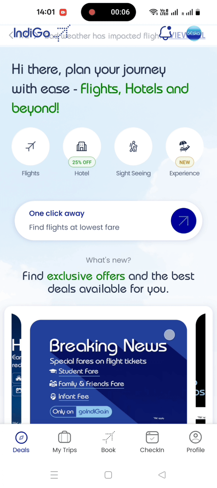
IndiGo Uses Swipeable Deal Strips to Drive Offer Discovery
Read more
 Discovery & Adoption
ixigo Maximizes Push Notification Opt-ins with Bottom Sheet
Read more
 Monetization
%20(1).gif)