
Your personalization is working. Open rates are up. Click-through on nudges looks healthy. The campaign dashboard is green.
And yet users are churning at month four. Feature adoption outside the core loop is flat. Your power users feel like the app hasn’t evolved in months—even though you’ve shipped constantly.
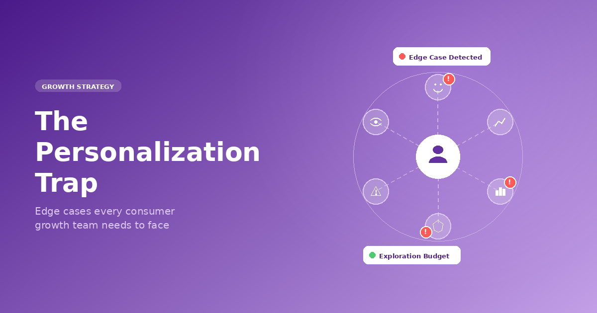
This is the quiet failure mode of personalization. Not a broken model. Not bad data. Just a system that got too good at telling users what they already like—and stopped doing the harder job of growing them.
At Plotline, we work with growth and product teams running in-app campaigns at scale—fintech apps, gaming platforms, quick-commerce, streaming, health. The edge cases below aren’t theoretical. They’re patterns we see repeatedly, in products that are performing well by most metrics and quietly losing users by the ones that matter.
1. Your Personalization Is Killing Feature Discovery
Every consumer app has a home feed, a nudge queue, or a story stack that’s being personalized. And most of them are running on pure exploitation: show what the user has engaged with before, optimize for the next tap.
That logic works for session depth. It destroys breadth.
A fintech app shows loan offers to users who’ve browsed loans—and never surfaces the new fixed deposit feature to the same cohort. A gaming app keeps showing streak reminders to streak-responsive users—and never tests whether those same users would engage with a tournament announcement. A quick-commerce app personalizes the home shelf based on last week’s orders—and the user never discovers the new grocery vertical that launched on Monday.
In every case, the personalization is technically correct. And in every case, it’s quietly narrowing the user’s world.
The fix: build an explicit exploration budget.
Reserve a fixed percentage of your in-app surface for content outside a user’s established pattern. Not randomly—curated, intentional, tested. Think of it as a deliberate allocation: 80% exploitation, 20% exploration. The exploration slot is where you introduce new features, adjacent categories, or formats a user hasn’t tried.
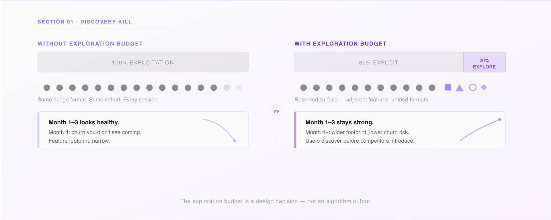
Spotify called this Discover Weekly and turned it into a retention engine. Your equivalent might be a native embed on the home screen, a story card in the feed, or a contextual bottom sheet triggered after a completed transaction. The format matters less than the commitment: some percentage of what you show users must challenge what you already know about them.

The question to pressure-test in your next growth review: what percentage of our personalized surface is pure exploitation, and when did we last measure what users are not discovering?
2. Your Most Personalized Users Are Your Most Vulnerable
Here’s a cohort analysis worth running if you haven’t: take your highest-engagement users—the ones with the most sessions, the strongest behavioral signal, the clearest model profile. Now check their feature footprint. How many distinct product surfaces have they touched in the last 90 days?
In most consumer apps, the answer is: fewer than you’d expect. Your best-personalized users are often your narrowest users. They’ve been guided so consistently toward what they like that they’ve never had a reason to explore anything else.
This is the depth trap. Personalization optimizes for depth—more sessions on the same surface. But long-term retention in consumer apps depends on width—users finding multiple reasons to come back before a competitor gives them a better one.
The lending app whose entire targeting stack is built around loan history will get very good at showing top-up offers at the right moment. Engagement on those offers will look great. But when a competitor drops rates, there’s no secondary hook. The user leaves because they only ever had one reason to stay.
The signal to watch
Compare feature breadth between your heavily personalized cohort (90+ days of behavioral history) and your lightly personalized cohort (30 days or less). If the older cohort has a narrower feature footprint, you have a depth trap.
The intervention
Set a behavioral staleness threshold. If a user’s in-app behavior hasn’t meaningfully changed in 60–90 days—same screens, same actions, same campaign responses—trigger a deliberate pattern break. A native widget surfacing something adjacent. A story card for a feature they’ve never opened. A contextual prompt asking if their goals have changed.
This is exactly the kind of trigger-based campaign that growth teams can run without engineering involvement using a platform like Plotline: define the condition (no new feature touch in 60 days), set the audience, deliver the experience. The goal isn’t to disrupt—it’s to ask the personalization model a question it’s been avoiding.
3. You’re Personalizing the Nudge. You’re Not Personalizing Who Needs One.
Most growth teams have thought carefully about what to show users. Very few have thought carefully about when to stop showing it.
The onboarding tooltip that guided a user through KYC on day 2 is still live on day 120. The streak reminder that re-engaged a lapsed user six weeks ago is still firing every morning. The “complete your profile” banner that made sense before first transaction is still appearing for users who’ve made thirty.
This is guidance debt—and it’s one of the most common ways consumer apps accidentally signal to their best users that the product doesn’t know them.
Expert users don’t want guidance. They want density. They want to move fast through a UI that trusts them. Every time a power user sees a tooltip they’ve already internalized, a walkthrough they’ve completed, or a nudge that assumes they’re still a beginner, the product loses a small amount of credibility. These losses don’t show up in campaign metrics. They show up in how users describe the app to friends.
Build lifecycle suppression rules into every campaign.
The framework is simple: map your guidance layer to user stage, and define explicit conditions under which each element turns off.
- Day 0–7: Full onboarding suite active
- Day 8–30: Core prompts only; basics suppressed
- Day 31–90: Advanced feature discovery only
- Day 90+: No proactive guidance; in-app help on demand
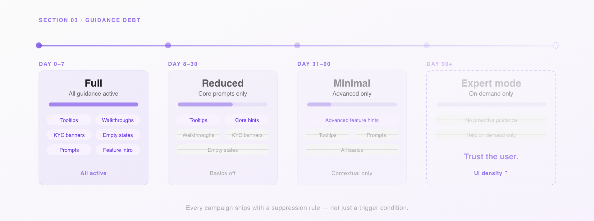
In practice, this means every campaign you run through your in-app engagement tooling should have a suppression condition, not just a trigger condition. “Show this nudge when the user has visited the savings tab” is a targeting rule. “Stop showing this nudge when the user has completed three savings transactions” is a lifecycle rule. You need both.
4. There Are Moments When You Should Stop Personalizing Entirely
Growth teams spend a lot of time thinking about when to personalize. Almost no time thinking about when not to.
There are at least four situations in a consumer app where the personalization layer should step back:
When the user changes context.
A user who has both a personal and a business account in your app doesn’t want signals from one bleeding into the other. If your targeting model doesn’t understand context separation, it’s blending data that should be siloed. The nudges feel slightly off even when they’re technically accurate—and users notice.
When the user signals a fresh start.
A user who’s just completed their first investment, hit their savings goal, or manually cleared their history is telling you something: their goals have shifted. If you keep serving them the same journey they came in on, you’re ignoring the signal. The product should feel like it noticed.
During high-stakes moments.
When a user is about to complete a transaction, submit a KYC document, or make an irreversible action—don’t personalize the confirmation screen. Don’t curate the warning dialog. Show everything. This is not the moment to be clever. Completeness matters more than relevance when the stakes are real.
When the outcome is consequential.
If your personalization layer is deciding which loan products a user sees, which insurance offers appear, or which investment options surface—you’re not just running a growth campaign. You’re making decisions with financial and potentially regulatory implications. Behavioral proxies don’t translate cleanly into consequential recommendations, and in regulated markets, they carry compliance risk. Know exactly where your targeting stack touches outcomes that matter beyond engagement.
5. You’re Probably Personalizing Based on Inference, Not Behavior
There’s a distinction that most consumer app teams blur without realizing it.
Behavioral signals are what users have actually done: screens visited, features used, transactions completed, campaigns engaged with. This is ground truth.
Inferential signals are what your model predicts about users based on behavioral patterns: cohort membership, inferred intent, predicted persona. This is one step removed from ground truth—useful, but a model output, not a user fact.
The problem isn’t using inference. The problem is treating inference like behavior without labeling the difference.
Here’s what it looks like in practice: a user opens your personal finance app to track household expenses. Your targeting model, trained on cohort data, infers “emerging small business owner.” You start surfacing business account features and SME content in your in-app campaigns. The user never said they were a business owner. Your model said it. The model is wrong.
Now you’ve built a feedback loop. You show business content, the user occasionally taps it (because it’s there), the model strengthens its inference, you show more. The user is trapped in a persona they didn’t choose. Your campaign metrics look fine—impressions are happening, CTR is passable. But the experience is quietly drifting from what the user actually needs.
Tag every signal in your personalization stack by its type.
Declared (user told you directly), derived (you observed the behavior), or inferred (your model predicted it). Weight declared > derived > inferred. When signals conflict, defer to the higher-trust source.
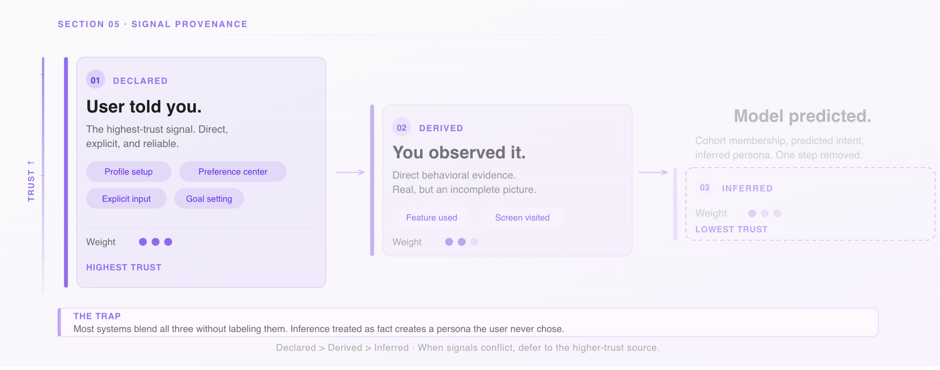
And build a correction mechanism. A preference center surfaced at the right moment in the user journey. A simple “is this relevant to you?” prompt on a campaign. These aren’t just UX niceties—they generate correction data that makes your model better, and they give users the sense that the product is listening rather than assuming.
6. Personalization That Users Can’t Read Doesn’t Build Trust
The optimistic theory of in-app personalization: users see the right content at the right time, take action faster, and feel like the product understands them.
The failure mode: the home screen changes and users don’t know why. A campaign appears and it feels random. A feature they relied on disappears from the surface and they file a support ticket to find it. The app feels slightly unpredictable—not broken, but not trustworthy either.
This is the legibility problem. Personalization only builds trust if users can roughly understand why they’re seeing what they’re seeing. When the logic is invisible, the experience feels arbitrary even when it’s accurate.
The signals of a legibility gap in consumer apps are specific: support contacts asking where a feature went, low tap rates on campaigns despite strong targeting (the model thinks it’s right, the user doesn’t act), and—most telling—users who turn off notifications or avoid personalized surfaces when given the choice.
The fix isn’t to explain the algorithm. It’s to make the logic feel human.
A nudge that says “you haven’t tried cashback rewards yet” is legible. A nudge that appears with no context after a session is not, even if it’s technically well-targeted. A story card that says “based on your recent transfers, here’s how to set up auto-save” connects cause to recommendation in a way users can follow.
This is where in-app communication format matters as much as content. The best personalized experiences in consumer apps don’t just surface the right thing—they briefly signal why it’s relevant now. That one line of context is what turns a campaign from a tap gamble into a recommendation a user can trust.
The Audit: Six Questions for Your Next Growth Review
If you’re running personalized in-app campaigns, walk through these before your next planning cycle:
On discovery
Are we actively measuring what users are not seeing? Do we have a deliberate exploration budget, or is our entire personalized surface driven by past behavior?
On depth vs. width
Do our most heavily personalized users have broader or narrower feature footprints than newer users? If narrower, what’s our intervention?
On guidance debt
Does every in-app campaign or guidance element have a suppression rule, not just a trigger? Are we still showing onboarding content to users who’ve been active for 90 days?
On off-ramps
Have we identified the moments in our app where personalization should pause—high-stakes transactions, context switches, fresh-start signals?
On signal quality
Can we distinguish declared, derived, and inferred signals in our targeting stack? Do users have any way to correct the model when it’s wrong?
On legibility
Do users understand why they’re seeing what they’re seeing? Are our campaigns creating trust, or just creating impressions?
The Thing Personalization Can’t Do for You
Personalization is one of the highest-leverage tools a growth team has. It makes experiences feel relevant, reduces friction at the right moments, and—when it’s working well—makes users feel like the product was built for them specifically.
But the edge cases above share a common thread: personalization optimizes for the signal it’s given. If the signal is “maximize next-session engagement,” it will deliver that, and quietly sacrifice discovery, trust, and long-term retention in the process.
The growth teams building durable consumer products don’t just ask “is our personalization accurate?” They ask “is it making users’ lives in the app bigger or smaller?” That question is harder to instrument. It’s also the one worth answering.
Plotline helps product and growth teams in consumer apps run contextual, behavior-driven in-app campaigns and user journeys—without engineering dependencies. If you want to think through how your targeting stack holds up against these questions, talk to us.
