.png)
We use cookies to ensure you get the best experience on our website. For more details, refer to our cookie policy and privacy policy.
Why do Amazon, Myntra, and Meesho now show navigation before products? They learned something uncomfortable about what users actually want.

Open any major shopping app right now. What do you see first?
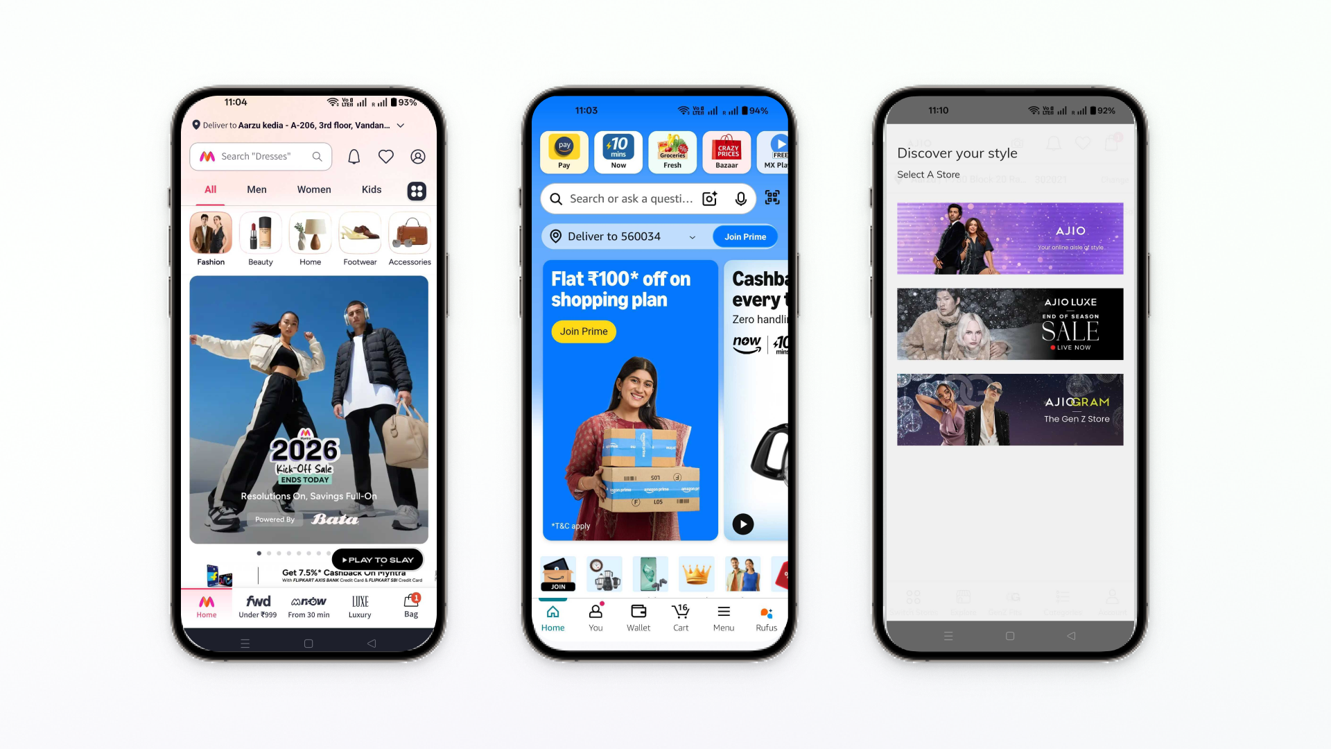
If you're on Amazon India, it's not a product. It's a row of services: Pay, Now, Fresh, Bazaar. If you're on Myntra, it's category navigation - All, Men, Women, Kids - before any banner screams "SALE!" at you. If you're on Meesho, it's trust signals: "Cash on Delivery," "7 Days Easy Return."
The product you came to buy? That comes later.
This isn't an accident. India's biggest e-commerce platforms have quietly redesigned their homepages over the past three years, and what they've learned contradicts everything we thought we knew about mobile commerce.
TL;DR:
Three years ago, the playbook was simple: big banner, big discount, clear button. Make them click. Measure conversion. Repeat.
It worked when mobile commerce was new and users expected to see "today's deal" front and center. But look at what's changed:
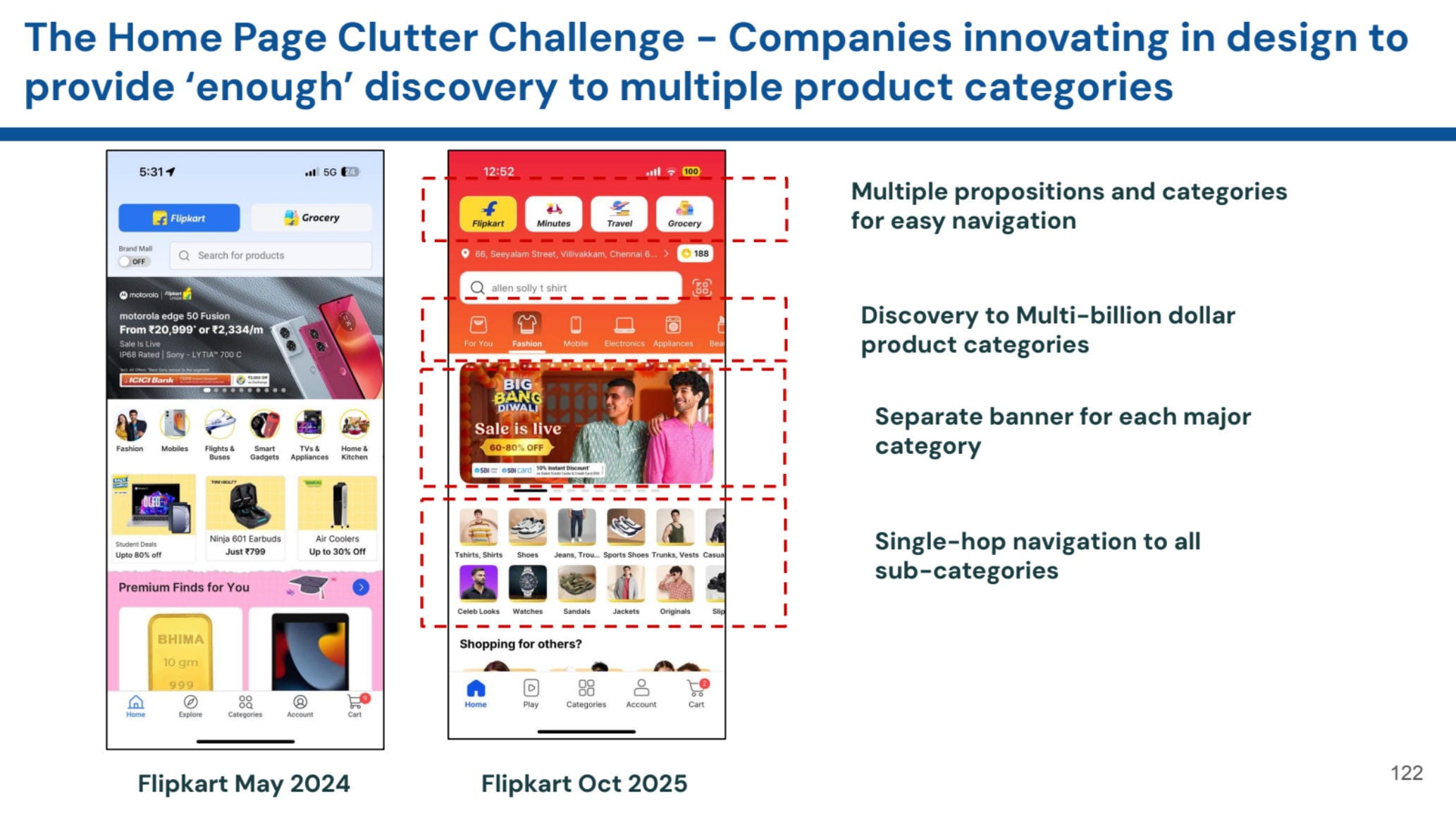
Myntra's homepage today:

Amazon India's approach:

Meesho's strategy:

Notice what all three have in common? They've stopped assuming you know what you want. They're giving you paths to figure it out.
Here's what these redesigns are really saying: most people who open your app aren't ready to buy the thing you're promoting.
The old model treated every app open like a cold lead. Show the best deal. Create urgency. Convert. If they don't bite, they bounce.
The new model acknowledges reality: many sessions start with vague intent. "I need... something. Let me look around."
When Myntra shows "Under ₹999," "From 30 min," and "Luxury" simultaneously, they're not confused. They're honest. Some users care about price. Others care about speed. Some want premium stuff. Why force all three through the same "50% off kurtas" banner?
When Amazon puts service tiles above products, they're training you to think of them for multiple needs, not just retail shopping. That "Fresh" tile? It's competing with your local grocery delivery app for space in your brain. That "Now" tile? It's saying: "Next time you need something urgently, think of us, not Blinkit."
This isn't about design trends. It's about platform economics and ensuring adoption across categories.
The counterintuitive part: giving users more options often drives better results than a single, focused message.
You're not forcing fit. If your hero banner promotes smartphones and I'm shopping for shoes, I'm bouncing. But if I see a "Footwear" category icon, you've kept me in the app. The conversion might not happen immediately, but the session is alive.
You reduce wasted visits. Every user who opens your app and immediately closes it because the banner doesn't resonate? That's a wasted acquisition cost. Multiple entry points mean if one path doesn't interest them, another might.
You build habits across categories. Meesho's product grid exposes you to categories you didn't plan to browse. Amazon's service tiles remind you they do groceries too. Each exposure is a seed planted for future visits.
You create sessions worth having. One-tap visits that don't convert teach you nothing about the user. But when someone browses three categories, views eight products, and leaves without buying? You've learned what they care about. That's data you can act on.
The platforms that win long-term aren't optimizing for today's conversion. They're optimizing for knowing you better with each visit.
We're not saying complex navigation always beats a focused message. Context matters enormously.
During sale events, the banner reclaims dominance.
AJIO's "NEW YEAR, NEW YOU: 50-90% OFF" takes up significant screen space. When users arrive with deal-hunting intent, give them the deal. FOMO is the product during sales.

For new user acquisition, clarity beats options. First impressions matter. If someone's downloading your app from a Facebook ad promising 50% off, deliver on that promise immediately. Don't make them hunt for it through category navigation.
For single-category businesses, multi-path navigation is overkill. If you only sell electronics, category icons won't help much. Better search and filters serve users more effectively.
For small catalogs, complexity confuses. If you have 200 products, not 200,000, don't pretend you're Amazon. A simple, focused homepage works better when choice isn't your advantage.
If you're rethinking your homepage (or any primary navigation), start here:
What percentage of your users know what they want?
Check your analytics. If 80% of sessions start with search and users rarely browse categories, they're coming with intent. Keep it simple. Make search prominent. Get out of their way.
But if users browse multiple categories, view many products, and take time to explore, they're discovering. Invest in navigation that supports that behavior.
How often do your users return?
If you're optimizing for one-time conversions (insurance, travel booking, furniture), a focused homepage makes sense. If you're building for repeat purchases (fashion, groceries, daily essentials), navigation investment pays off over time.
How diverse is your catalog actually?
If you're spanning verticals that users genuinely shop across, the navigation challenge is different. Amazon organizes by service type (Now, Fresh, Pay) because their catalog spans retail, groceries, entertainment, and payments. That requires different thinking than "we sell shoes and bags."
Are first-time users seeing the same thing as returning users?
They probably shouldn't be. New users need clarity and trust signals. Returning users need shortcuts and personalization. Meesho leads with trust props for a reason, many of their users are first-time e-commerce shoppers. Your analytics should inform this.
We help product teams launch user experiences without waiting weeks for dev resources. This homepage evolution directly shapes how we think about engagement:
Context changes everything.
A nudge that works when someone's browsing (like "Popular in this category") annoys someone who's searching for a specific product. The same message at the wrong moment is noise, not help.
Progressive disclosure matters more than we thought.
Meesho doesn't show everything at once. They greet you, build trust, show products, then offer category navigation. That sequence matches the mental journey. Engagement should follow the same principle, reveal features as users demonstrate readiness, not all at once.
Measure the right things.
If we only measured click-through rates, we'd think intrusive pop-ups work great. But when we measure session quality, repeat visits, and long-term retention, subtler approaches often win. An engagement that drives immediate action but reduces session depth is a bad trade.
Integration beats interruption.
Notice how Amazon embeds "Rufus" (their AI assistant) into bottom navigation, not as a pop-up. Myntra's value shortcuts feel like native navigation, not added features. Good engagement feels like a natural part of the product, not a layer on top.
Want to see how contextual, non-intrusive engagement works in practice? Book a demo to explore how Plotline helps you create in-app experiences that feel native, not bolted-on.
These platforms aren't startups anymore. They're mature businesses with returning customers. The economics have changed:
Old model: High acquisition cost → Must convert immediately → Measure success by first transaction
New model: Similar acquisition cost → Focus on lifetime value → Multiple categories × Multiple sessions = Higher long-term value
When Myntra adds "From 30 min" delivery to their navigation, they're not trying to acquire new users. They're trying to increase order frequency among existing users. That's a mature platform strategy.
When Amazon prominently features Fresh and Now, they're expanding the number of occasions you think to open their app. More occasions = more frequent use = higher lifetime value.
The shift from conversion-focused to discovery-focused design reflects confidence that they'll get their conversion eventually—if they can keep you engaged.
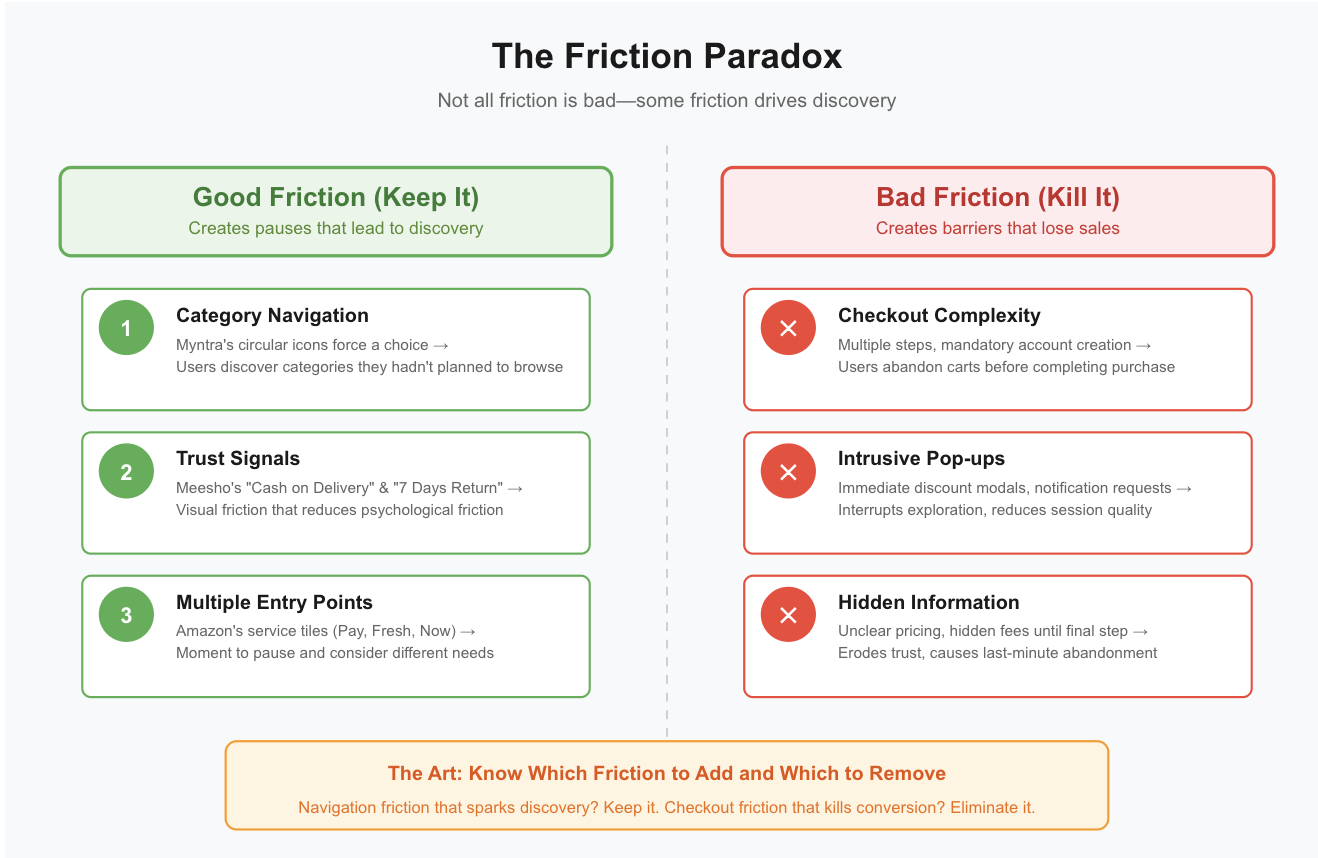
We're trained to remove friction. Fewer taps. Clearer paths. Faster checkout. But discovery needs the pause to notice something unexpected, the moment to explore a category you hadn't considered.
Myntra's circular category icons create a moment of friction - you must choose - that leads to discovery. You might pick a category you hadn't planned to browse. That friction is valuable.
Meesho's trust signals add visual friction (more to process) but reduce psychological friction (concerns about trustworthiness). That's the right trade-off for their audience.
The art is knowing which friction to add and which to remove. Navigation friction that leads to discovery? Keep it. Checkout friction that loses sales? Kill it.
The homepages of India's biggest e-commerce apps have changed because their users have changed. Early mobile commerce users arrived with clear intent, primed by aggressive deals marketing. Today's users are more sophisticated—they're browsing, comparing, exploring across categories.
The platforms that win aren't shouting louder. They're listening better. They're acknowledging that they don't know what you want when you open the app, so they're giving you paths to figure it out yourself.
This doesn't mean the hero banner is dead or that complex navigation always wins. It means the right approach depends on your users' actual behavior, not your ideal conversion funnel.
Check your analytics. Are users arriving with intent (high search usage, low browsing) or exploring (low search, high category navigation)? Are they first-time visitors or returning customers? Is your catalog deep enough to justify navigation investment?
The homepage isn't dead. It's just finally becoming what it should have been all along - a starting point designed for how users actually behave, not how we wish they would.
%201.svg)

%201.svg)
%201.svg)
Join companies like Zepto, Meesho, Upstox and others that use Plotline to test and launch app experiences and boost activation, retention and monetization.
Join companies like Zepto, Step Banking, Dream 11 and others that use Plotline to boost conversions
.png)

.jpg)