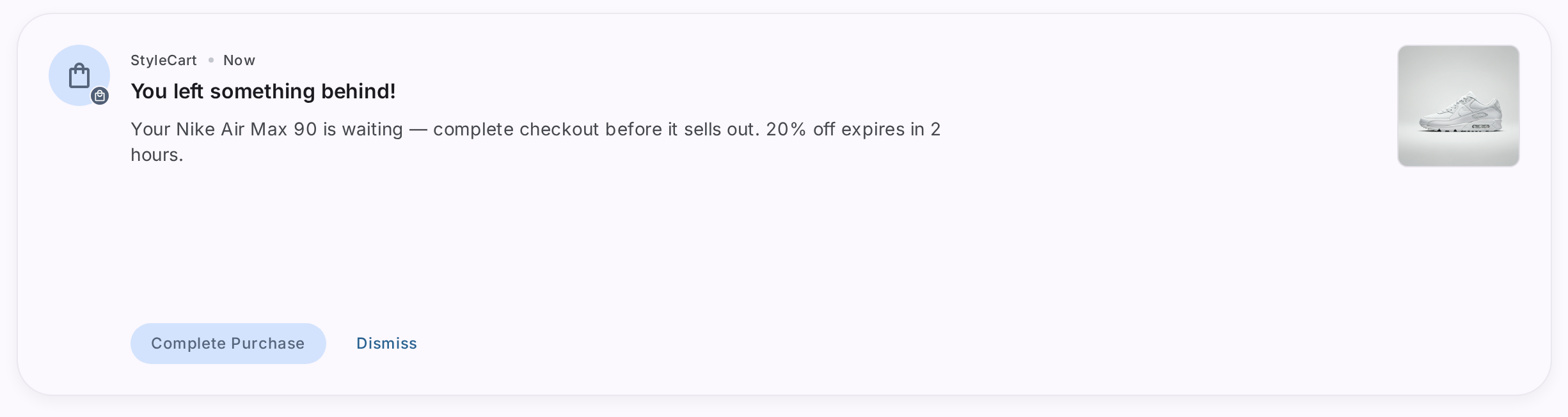
Your customer just added three items to their cart and left. Thirty minutes later, you send a text-only push notification: “Complete your purchase!” They glance at it, swipe it away, and forget about it.
Now imagine the same scenario, but the notification shows a live countdown timer (“Flash sale ends in 00:44:25”), a product image of the exact sneakers they were browsing, and a progress bar depleting in real time. That’s a fundamentally different experience — and it drives fundamentally different results.
Interactive push notifications transform the notification tray from a graveyard of ignored messages into a high-converting storefront. For e-commerce apps, where every second of attention matters and every cart recovery counts, they’re no longer a nice-to-have.
This guide covers the most effective interactive push notification formats for e-commerce, how to use each one strategically, and how to stitch push notifications into in-app journeys that convert.
TL;DR
- Interactive push notifications include carousels, countdown timers, image grids, background images, milestone trackers, and dynamic content — all directly inside the notification shade
- Timer-based notifications create real-time urgency for flash sales, driving up to 3x higher open rates than static promotions
- Product carousels let users browse 3-5 items without opening the app, turning a single notification into a mini-storefront
- Milestone trackers show real-time order progress (placed → shipped → delivered) directly in the notification, reducing “where’s my order” support tickets
- The biggest unlock: stitching push notifications to in-app experiences (modals, bottom sheets, landing pages) so the tap leads to an immediate, conversion-optimized experience — not just a home screen redirect
- With tools like Plotline, you can deploy all of these templates and journeys without writing code
Why Standard Push Notifications Fall Short in E-Commerce
The average smartphone user receives 46 push notifications per day. E-commerce apps are competing with banking alerts, social media updates, messaging apps, and news — all in the same notification tray.
A plain text notification that says “Check out our new arrivals!” gets buried instantly. It looks like every other notification. It communicates nothing visual about the products you’re selling. And it gives the user zero reason to tap instead of swipe.
E-commerce is inherently visual. Your products are sold on imagery, pricing, and urgency. Your push notifications should reflect that.
Interactive push notifications bring the shopping experience into the notification shade: product images, price comparisons, countdown timers, and swipeable carousels. They turn a passive “hey, come back” message into an active browsing experience.
The Interactive Push Notification Toolkit for E-Commerce
1. Countdown Timers — Drive Urgency for Flash Sales
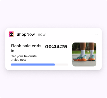
A ticking countdown timer in the notification tray is impossible to ignore. Unlike static text that says “sale ending soon,” a live timer communicates scarcity without needing to say a word. Users see time literally running out and feel compelled to act.
How e-commerce apps use timer notifications:
- Flash sale countdowns: “Flash sale ends in 00:44:25” with a depleting progress bar — the timer creates urgency, the progress bar reinforces it visually
- Limited-time free shipping: “Free shipping for the next 2 hours” with a live countdown
- Cart expiry: “Items in your cart are selling fast — reserved for 30 more minutes”
- Exclusive early access: “Member-only pricing ends at midnight” with a timer ticking down
Why it works for e-commerce: Loss aversion is one of the most powerful psychological triggers in shopping. When a customer sees a timer counting down on a deal they were considering, the perceived cost of inaction becomes higher than the cost of acting. The progress bar adds a second visual signal — as the bar depletes, the urgency compounds.
Pro tip: Pair the timer with a product image to combine urgency with visual appeal. A countdown alongside the exact product the user was browsing is significantly more effective than a timer on a generic sale message.
2. Product Carousels — Turn Notifications into Mini-Storefronts
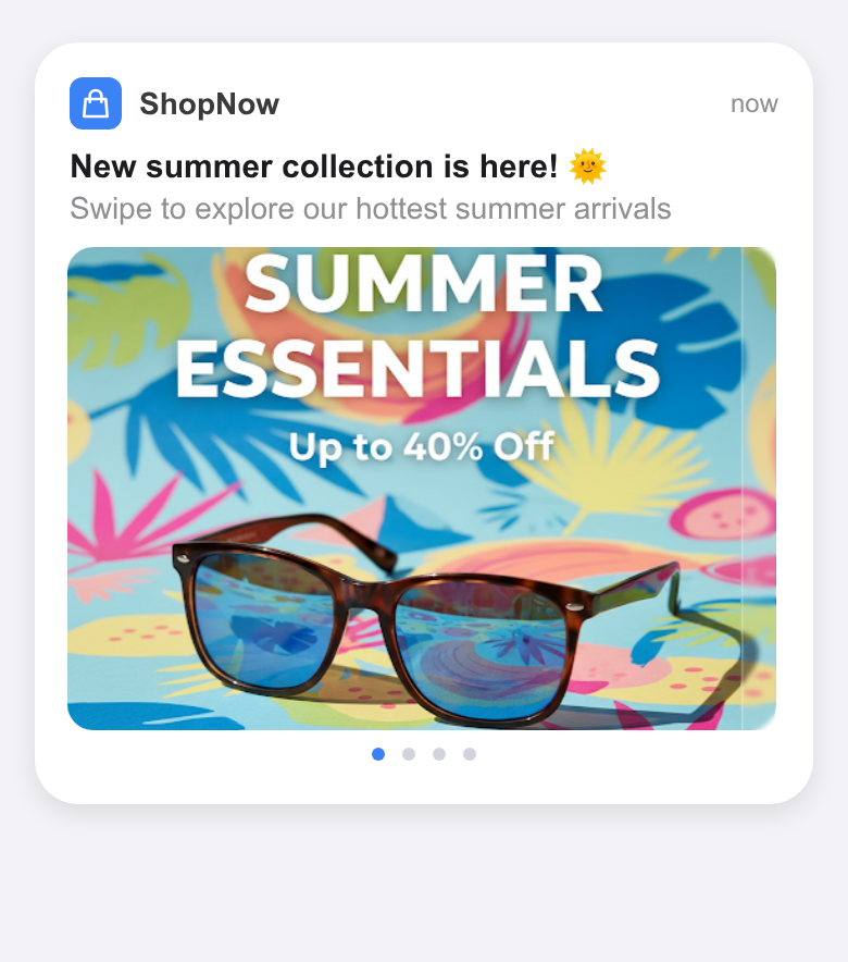
Product carousels let users swipe through 3-5 products directly inside the notification shade. Auto-scrolling carousels take it further — they cycle through products automatically, catching the user’s eye even when they’re not actively interacting with the notification. Each card can have its own image, title, price (including strikethrough pricing), and a CTA that deep-links to the product page.
How e-commerce apps use carousel notifications:
- Abandoned cart recovery: Show the exact items left in the cart as swipeable cards — each linking to the checkout page
- Personalized recommendations: “Based on your recent browsing” followed by a carousel of recommended products
- Multi-deal promotions: During a sale event, showcase the top deals across categories
- New arrivals: Display the latest products in a category the user has shown interest in
- Back-in-stock alerts: “3 items from your wishlist are back” — each card linking to a different product
Why it works for e-commerce: Instead of choosing one product to feature in a notification (and risking it being irrelevant), a carousel gives the user multiple options. If they’re not interested in the first product, they might swipe and find one they love. Auto-scrolling carousels are especially powerful because they showcase products passively — the user doesn’t even need to interact for the notification to cycle through your catalog. One notification, multiple chances to convert.
3. Image Grids — Maximum Visual Impact in a Single Glance
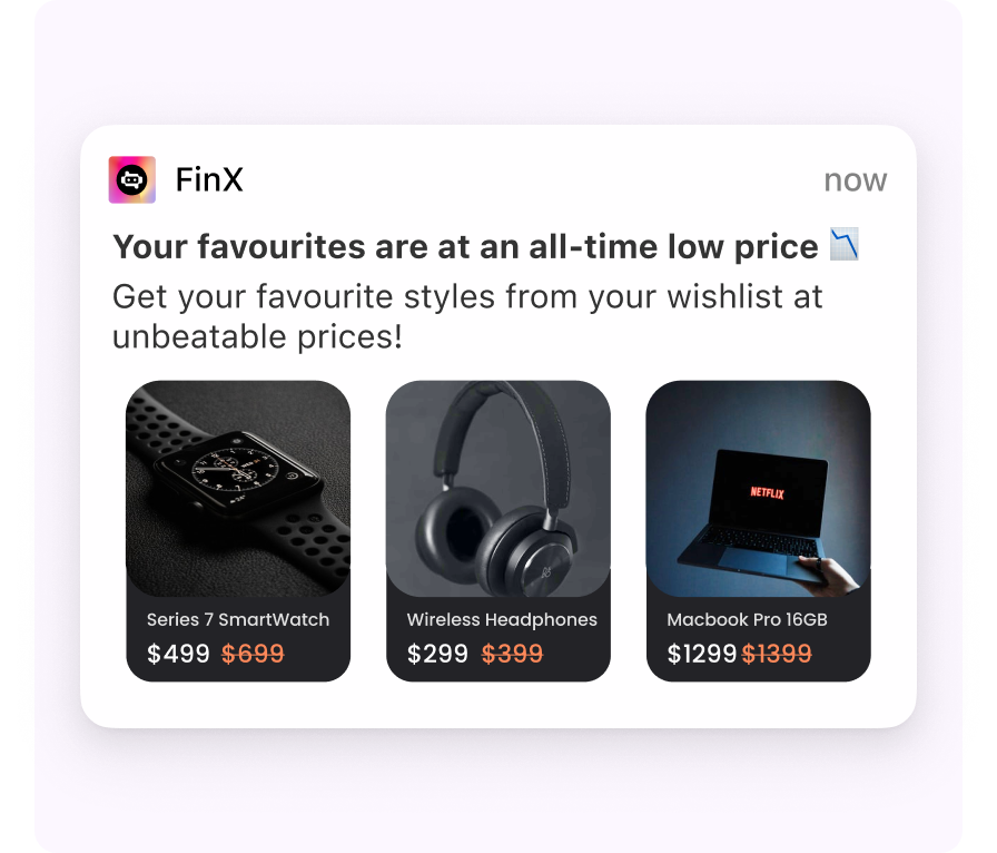
Grid layouts display multiple product images in structured formats (1x3, 1x4, 2x2) within a single notification. Each image in the grid links to a different product page. Users can visually scan all options at a glance and tap the one that interests them.
How e-commerce apps use grid notifications:
- Wishlist price drops: Show 3-4 wishlist items that just dropped in price, each with the original and new price
- Category highlights: “Top picks in Electronics” with a grid of 4 trending products
- Daily deals: A grid of today’s best offers across categories
- “Complete the look”: Show complementary products to a recent purchase (shoes → socks, belt, bag)
Why it works for e-commerce: Grids pack maximum visual information into a single notification. For visually-driven categories like fashion, home decor, and electronics, the image itself is the primary hook. Users process images 60,000x faster than text — a grid of 4 product images communicates more in a glance than a paragraph of copy.
4. Background Image Notifications — Brand-First Visual Campaigns
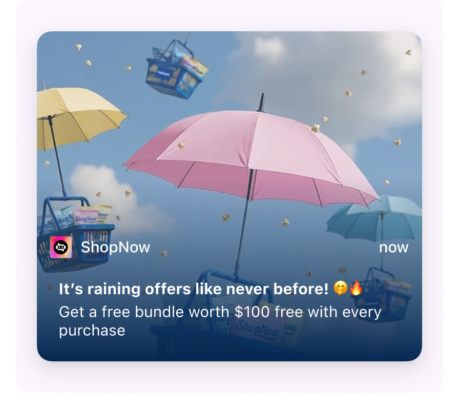
Background image templates use a full-bleed image as the notification canvas, with text and CTAs overlaid on top. The result is a visually rich, poster-like notification that stands out dramatically in the notification shade.
How e-commerce apps use background image notifications:
- Seasonal campaigns: A festive-themed background (Diwali, Black Friday, Christmas) with “Up to 50% off” overlaid
- Brand launches: A hero product shot as the background for a new collection drop
- Exclusive member offers: A premium-feeling visual with “Members-only: Free bundle worth $100 with every purchase”
- App-wide events: A campaign visual for a shopping festival or anniversary sale
Why it works for e-commerce: Background images transform the notification from a standard system element into a branded visual experience. They feel less like a notification and more like a campaign creative — which is the point for high-impact brand moments where visual storytelling matters more than informational density.
5. Dynamic Personalization — Every Notification Feels 1:1
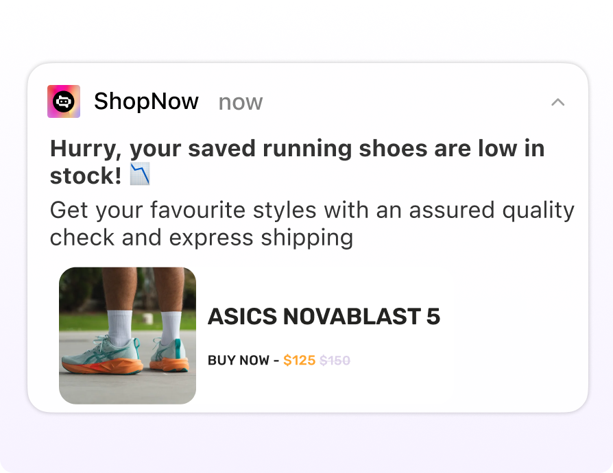
Dynamic content templates pull personalized data into the notification in real time — user names, recently browsed products, wishlist items, cart values, or loyalty point balances. Combined with a product image and a direct CTA, these notifications feel like a personal shopping assistant rather than a mass broadcast.
How e-commerce apps use dynamic notifications:
- Low stock on saved items: “Hurry, your saved running shoes are low in stock!” with the exact product image, name, and discounted price — plus a “Buy Now” CTA
- Price drop on browsed items: “Hey {name}, the {product_name} you viewed is now ₹{new_price} (was ₹{old_price})!”
- Loyalty point reminders: “You have {points} points expiring this week. Redeem them before they’re gone!”
- Restock alerts: “{product_name} is back in stock — and it’s selling fast”
- Cart value incentives: “Your cart is ₹{amount_away} away from free shipping. Add one more item!”
Why it works for e-commerce: Personalization is the single biggest driver of push notification engagement. A notification about the specific product this user was looking at — complete with its image, discounted price, and a one-tap purchase option — will always outperform a generic “check out our deals” message. Dynamic personalization turns mass-broadcast push into 1:1 conversations at scale.
6. Timer + Carousel Hybrid — Urgency Meets Choice
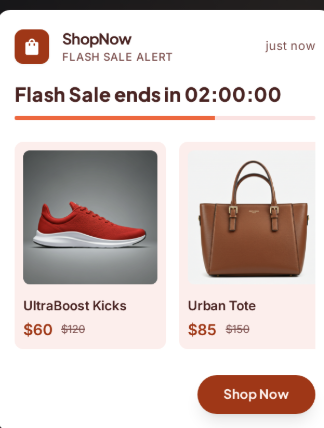
This hybrid template combines a countdown timer with a swipeable product carousel — two of the most engaging elements in a single notification. The timer creates urgency while the carousel offers choice.
How e-commerce apps use timer + carousel notifications:
- Flash sale with multiple products: “Sale ends in 2:00:00” + a carousel of the top discounted items
- Happy hour deals: “Order in the next 30 minutes for extra 10% off” + carousel of qualifying products
- Auction-style events: Timer counting down alongside carousel of auction items
Why it works for e-commerce: This template combines two psychological triggers — urgency (the timer) and choice (the carousel). Users feel pressure to act quickly AND have multiple options to choose from. If the first product doesn’t hook them, the next swipe might — and the timer ensures they don’t just save it for later.
7. Milestone Trackers — Turn Order Updates into Engagement Touchpoints
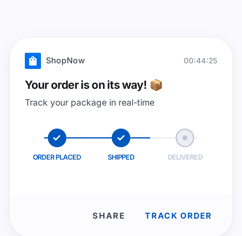
Milestone tracker notifications show a visual progress bar directly in the notification shade — the user can see exactly where their order is in the fulfillment journey without opening the app. Combined with a countdown timer showing the estimated delivery window, these notifications turn a mundane status update into an engaging, anticipation-building experience.
How e-commerce apps use milestone tracker notifications:
- Order tracking: “Your order is on its way! 📦” with a progress stepper showing Order Placed ✓ → Shipped ✓ → Delivered (pending), plus a “Track Order” CTA
- Delivery countdown: Timer showing estimated time until delivery alongside the milestone tracker
- Return/refund status: “Your return is being processed” with milestones for Return Requested → Picked Up → Refund Initiated → Refund Completed
- Loyalty tier progress: “You’re 2 orders away from Gold status” with a milestone tracker showing tier progression
Why it works for e-commerce: “Where’s my order?” is the single most common customer support query for e-commerce apps. Milestone tracker notifications answer this question proactively — before the user even thinks to ask. The visual progress stepper is inherently satisfying (users love watching progress complete), and the “Track Order” CTA drives app opens at a moment when the user is already engaged and likely to browse. Post-purchase engagement is also the best time for cross-sell recommendations, making this a strategic re-entry point.
Pro tip: Trigger milestone notifications from backend events (order_shipped, out_for_delivery) using real-time journey stitching. When the user taps “Track Order,” open directly to a tracking page or a bottom sheet with delivery details + recommended products — not the home screen.
The Real Power Move: Stitching Push to In-App Journeys
Templates are powerful, but the biggest conversion unlock isn’t the notification itself. It’s what happens after the user taps.
Most e-commerce push notifications make this mistake: the user taps the notification and lands on the app’s home screen. Now they have to navigate to the product, find the deal, and rediscover the context from the notification. Every extra tap is a drop-off point.
Push-to-in-app journey stitching eliminates this friction entirely.
How It Works
When a user taps a push notification, instead of opening the home screen, Plotline can immediately display a targeted in-app experience — a full-screen landing page, a bottom sheet with the deal details, a carousel of products, or a gamification experience like a scratch card or spin-the-wheel.
The push notification becomes the first frame of a complete in-app journey:
Push notification → Tap → In-app experience → Conversion
No home screen redirect. No navigation. The notification and the destination are one continuous experience.
E-Commerce Journey Examples
Flash Sale Journey
- Push: Timer notification — “Flash sale ends in 2 hours. Top deals inside”
- Tap → In-app landing page: Full-screen sale page with category-wise deals, countdown timer, and “Shop Now” CTAs for each category
- Result: User lands directly in the sale experience, not the home screen
Abandoned Cart Recovery Journey
- Push: Product carousel showing the 3 items left in cart
- Tap → Bottom sheet: “Complete your order” bottom sheet with cart summary, total amount, and a “Checkout Now” button
- Optional step: If the user dismisses the bottom sheet, show a floating button with a discount code (“Use SAVE10 for 10% off”) that persists as they browse
New User Activation Journey
- Push: Background image notification — “Your welcome offer is waiting”
- Tap → Scratch card game: A scratch card revealing a personalized discount (10%, 15%, or 20% off)
- After reveal → Modal: “You won 15% off! Apply to your first order” with a CTA that deep-links to the relevant category
- Result: The push notification led to a gamified experience that led directly to conversion — a multi-step journey deployed without code
Price Drop + Cross-Sell Journey
- Push: Grid notification showing 3 wishlist items with price drops
- Tap → Modal: “Your wishlist items dropped in price!” with updated prices and “Add to Cart” buttons
- After adding to cart → Bottom sheet: “Complete the look” — complementary products as a carousel
- Result: The push notification recovered a dormant wishlist AND drove a cross-sell, all in a single journey
Order Tracking → Cross-Sell Journey
- Push: Milestone tracker notification — “Your order is on its way!” with Order Placed ✓ → Shipped ✓ → Delivered (pending)
- Tap → Bottom sheet: Delivery details with estimated arrival time + a “While you wait” carousel of complementary products
- Result: A routine order update becomes a cross-sell opportunity at peak engagement
Backend-Triggered Real-Time Journeys
The most powerful stitched journeys don’t even start with a traditional push notification. They start with a backend event.
When a customer completes a purchase, your backend fires a purchase_completed event. Plotline uses a silent push to relay this event to the app’s frontend in real time. The app then immediately displays an in-app experience:
- Post-purchase: Purchase completed → in-app modal with order confirmation + “You earned 500 loyalty points” + cross-sell carousel of complementary products
- Restock: Item back in stock → push notification to interested users → tap → bottom sheet with “Add to Cart” pre-filled
- Order shipped: Shipping status updated → milestone tracker push notification → tap → tracking bottom sheet with cross-sell recommendations
- Cart value milestone: Cart crosses ₹2,000 → in-app tooltip near checkout: “You qualify for free shipping!”
These real-time backend-triggered journeys run automatically. No manual campaign scheduling. The event fires, the experience appears.
Best Practices for E-Commerce Push Notifications
Match the template to the use case
Don’t use a carousel just because it looks impressive. If you’re communicating a single urgent deal, a timer template is more effective. If you’re showcasing multiple products, a carousel or grid fits better. The template should amplify the message, not distract from it.
| Use Case | Best Template |
|---|---|
| Flash sale with deadline | Timer with progress bar |
| Abandoned cart (multiple items) | Product carousel |
| Price drop on specific item | Dynamic content with image |
| Seasonal campaign launch | Background image |
| Daily deals showcase | Grid layout (2x2 or 1x3) |
| Limited-time multi-product sale | Timer + carousel hybrid |
| Order status updates | Milestone tracker with timer |
| Low stock on saved items | Dynamic personalization with product image |
Personalize beyond the first name
Name insertion is table stakes. The e-commerce apps with the highest push CTRs personalize based on:
- Browsing history: Products they viewed but didn’t buy
- Cart contents: The specific items they’re considering
- Wishlist activity: Price drops on items they’ve saved
- Purchase patterns: Complementary products based on past orders
- Loyalty tier: Tier-specific offers and point balances
Dynamic personalization with Liquid Tags can pull any of these attributes into your notification content at send time.
Don’t end the experience at the tap
The notification is step one. What the user sees after tapping determines whether they convert. Always stitch push notifications to a relevant in-app experience — a product page, a landing page, a gamification element, or a checkout bottom sheet. Never redirect to the home screen.
Respect frequency — especially during sales
Sale events tempt growth teams to flood the notification tray. Resist the urge. Set frequency caps (max 2-3 push notifications per day) and implement DND windows to avoid 3 AM notifications. A beautifully designed carousel notification at the wrong time still gets your app uninstalled.
Use global frequency capping across all channels — a user receiving 4 pushes + 3 emails + 2 WhatsApp messages = 9 touches, even if each channel looks fine individually.
A/B test template types, not just copy
Most teams A/B test notification copy. Fewer test the template itself. You might find that a simple image notification outperforms a carousel for your audience — or that a timer drives 3x more conversions than a static promotion. Run A/B tests between template types for the same campaign objective and let data drive your template selection.
Getting Started with Interactive Push Notifications
Interactive push notifications aren’t complex to set up — with the right tool. Plotline offers 20+ rich push notification templates, all configurable from the dashboard without code:
- No-code template builder: Select a template, customize content, set audience and triggers, and publish. No engineering effort per campaign.
- Dynamic template additions: New templates are added without SDK updates. Your template library grows automatically.
- Built-in personalization: Use Liquid Tags to insert user attributes — names, product details, cart values, loyalty points — into any template.
- Journey stitching: Connect push notifications to in-app experiences — the tap triggers a modal, bottom sheet, landing page, or gamification experience immediately.
- Cross-channel orchestration: Combine push with in-app nudges, WhatsApp, email, and SMS in multi-step journeys with branching logic and delays.
- A/B testing with Smart Switch: Test different templates and copy, with automatic winner selection based on your goal metric.
For e-commerce apps, the notification tray is prime real estate. Make every notification count.