

Context
On the home screen of its app, IndiGo displays a swipeable deal strip that showcases special fare types — including student discounts, hotel offers, and their blue chip membership benefits.
These deals are arranged in a horizontally scrollable format that sits just below the fold, ensuring that users encounter it while exploring travel options without overwhelming them on app launch.
Each card is visually distinct, highlighting one offer at a time with clear CTAs and icons to drive faster comprehension and engagement.
Why This Works
Users often miss buried or static banners — but swipeable strips drive interaction through movement, maximize screen efficiency, and surface multiple offers in a single glance.
By presenting deals as a swipe-through feed, IndiGo creates a familiar, mobile-native way to explore benefits — improving discovery and boosting CTRs on seasonal or targeted promos.
Check out more user experiences from leading apps
 Discovery & AdoptionPowered by Plotline
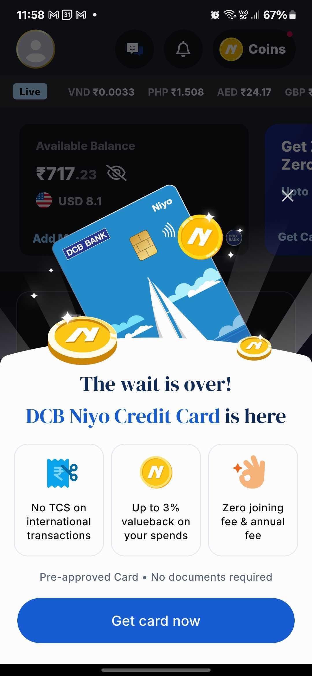
Niyo Uses a Bottom Sheet to Announce New Product Launches Without Disrupting the Core Experience
Read more
 Onboarding & Activation
Stable Money Uses a Step-by-Step Profile Quiz to Personalize the Investment Journey
Read more
 Monetization
Zepto Uses Scrollable Video Widgets to Showcase Sponsored Products in Search
Read more
 Discovery & Adoption
ixigo Maximizes Push Notification Opt-ins with Bottom Sheet
Read more
 Monetization
Zupee Promotes League Participation with Real-Time Countdown
Read more
 Discovery & Adoption